Scatter Plots
IT Visibility is being upgraded with the introduction of Technology Intelligence Platform beginning in September 2024. Flexera will contact you directly regarding the timeframe of your upgrade. With Technology Intelligence Platform, out-of-the-box IT Visibility dashboards are being replaced with new, enhanced IT Visibility Technology Intelligence Platform reports. For more information, see IT Visibility With Technology Intelligence Platform Reports.
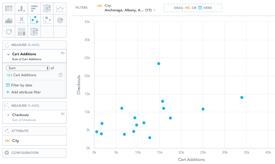
Scatter plots show data as points using Cartesian coordinates. Scatter plots can have two measures, one for the X-axis and the other for the Y-axis, and one attribute, which determines the meaning of each data point. You can use scatter plots to analyze trends between two measures or to track the magnitude of two measures from the same chart.
Scatter plots have the following sections: Measure (X-axis) , Measure (Y-axis) , Attribute , and Configuration .
For information about common characteristics and settings of all insights, see Insight Types.